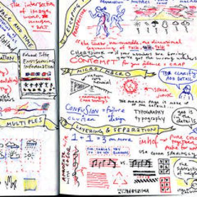
Confusion and clutter are failures of design, not attributes of information. And so the point is to find design strategies that reveal detail and complexity - rather than to fault the data for an excess of complication. Or, worse, to fault viewers for a lack of understanding.
We've drifted into this presentation mode without realizing the cost to the content and the audience in the process.
The goal is to provide analytical tools that will last students a lifetime
Make all visual distinctions as subtle as possible, but still clear and effective.
My father worked for governments all his life as an engineer and public works director.
Good design is a lot like clear thinking made visual.
Simple design, intense content.
Allowing artist-illustrators to control the design and content of statistical graphics is almost like allowing typographers to control the content, style, and editing of prose.
There are many true statements about complex topics that are too long to fit on a PowerPoint slide.
If you like overheads, you'll love PowerPoint.
There are only two industries that refer to their customers as 'users'.
The idea of trying to create things that last-forever knowledge-has guided my work for a long time now.
It is straightforward for me to be ethical, responsible, and kind-hearted because I have the resources to support that.
What this means is that we shouldn't abbreviate the truth but rather get a new method of presentation.
Science and art have in common intense seeing, the wide-eyed observing that generates empirical information.
If you’re told what to look for, you can’t see anything else.
Graphical excellence is that which gives to the viewer the greatest number of ideas in the shortest time with the least ink in the smallest space.
What gets left out is the narrative between the bullets, which would tell us who's going to do what and how we're going to achieve the generic goals on the list.
A curious consequence is that I have become a minor celebrity.
The world is complex, dynamic, multidimensiona l; the paper is static, flat. How are we to represent the rich visual world of experience and measurement on mere flatland?
The world is generally multivariate
It is not how much empty space there is, but rather how it is used. It is not how much information there is, but rather how effectively it is arranged.
I have stared long enough at the glowing flat rectangles of computer screens. Let us give more time for doing things in the real world...plant a plant, walk the dogs, read a real book, go to the opera.
The minimum we should hope for with any display technology is that it should do no harm.
I do believe that there are some universal cognitive tasks that are deep and profound - indeed, so deep and profound that it is worthwhile to understand them in order to design our displays in accord with those tasks.
Clutter and confusion are failures of design, not attributes of information.
I think it is important for software to avoiding imposing a cognitive style on workers and their work.
The most common user action on a Web site is to flee.
The speculative part of my work is that these particular cognitive tasks - ways of thinking analytically - are tied to nature's laws.
An open mind but not an empty head.
Public discussions are part of what it takes to make changes in the trillions of graphics published each year.
If the statistics are boring, you've got the wrong numbers.
The idea is that the content is the interface, the information is the interface, not computer-administrative debris.
The world is much more interesting than any one discipline.
The leading edge in evidence presentation is in science; the leading edge in beauty is in high art.
Design cannot rescue failed content.
Clutter is not an attribute of information, clutter is a failure of design...fix the design rather than stripping all the detail out of the map.
A metaphor for good information design is a map. Hold any diagram against a map and see how it compares.
There is no such thing as information overload, just bad design. If something is cluttered and/or confusing, fix your design.
I was writing a chapter of Beautiful Evidence on the subject of the sculptural pedestal, which led to my thinking about what's up on the pedestal - the great leader.
My idea here is that, inasmuch as certain cognitive tasks and principles are tied to nature's laws, these tasks and principles are indifferent to language, culture, gender, or the particular mode of information that is provided.
Here's the general theory: To clarify, add detail. Imagine that. To clarify, add detail. And clutter and overload are not an attribute of information, they are failures of design. If the information is in chaos, don't start throwing out information, instead fix the design.
A practical part of my teaching is to provide demonstrative, hands-on experiences.
Audience boredom is usually a content failure, not a decoration failure.
Good design is clear thinking made visible, bad design is stupidity made visible
The essential test of design is how well it assists the understanding of the content, not how stylish it is.
Great design is not democratic; it comes from great designers. If the standard is lousy, then develop another standard.
If your words aren't truthful, the finest optically letter-spaced typography won't help.
PowerPoint presentations too often resemble a school play - very loud, very slow, and very simple.
PowerPoint is like being trapped in the style of early Egyptian flatland cartoons rather than using the more effective tools of Renaissance visual representation.
Beautiful Evidence is about the theory and practice of analytical design.
If your words or images are not on point, making them dance in color won't make them relevant.
Only drug dealers and software companies call their customers 'users'
That is to say, nature's laws are causal; they reveal themselves by comparison and difference, and they operate at every multivariate space, time point.
If there is a well thought-out design standard, it should be followed. In practice, great design comes from great designers. That is empirically the case. If a great designer did a first-rate standard, that model should be followed. Great design is not democratic; it comes from great designers. If the standard is lousy, then develop another standard.
I hope that I am generous and tolerant, but certainly on the intellectual side I think that there are discoverable truths, and some things that are closer approximations to the truth than others.
The point of the essay is to change things.
What is to be sought in designs for the display of information is the clear portrayal of complexity. Not the complication of the simple; rather the task of the designer is to give visual access to the subtle and the difficult - that is, revelation of the complex.
In general, I think audiences are a lot smarter than people think. So, it's not "know your audience", it's "respect your audience, and really know your content".
I am certainly not an intellectual relativist, nor a moral relativist.
Design isn't crafting a beautiful, textured button with breathtaking animation. It's figuring out if there's a way to get rid of the button altogether.
Above all else show the data.
The best graphics are about the useful and important, about life and death, about the universe. Beautiful graphics do not traffic with the trivial.
Clutter is not a property of information. Clutter is a failure of design.
The commonality between science and art is in trying to see profoundly - to develop strategies of seeing and showing.